Help - Search - Members - Calendar
Full Version: Dawn approaches Ceres
Unmanned Spaceflight.com > Other Missions > Cometary and Asteroid Missions > Dawn
Pages: 1, 2, 3, 4, 5, 6, 7, 8, 9, 10, 11, 12, 13, 14, 15, 16
Holder of the Two Leashes
QUOTE (Phil Stooke @ Feb 5 2015, 06:17 PM) *
Compare it with a view of an almost full moon - on one edge the terminator shows stark relief. On the other side you see nothing but albedo markings.
Phil


Ah yes, putting it that way... you're quite right. So... still too early to tell.
Gerald
Very preliminary OpNav2 (based on Ceres_OpNav2_Anim_v2.gif) and OpNav3 (based on pia19179-16.gif) merged rectangular longitude/latitude maps show the respective surface coverage of the two sequences:
Click to view attachment Click to view attachment
(The two maps are horizontally shifted)
For OpNav3 the rotation steps are about 6 degrees, about three-fold the steps for OpNav2.
The OpNav3 map version is work in progress, and needs more accurate registering to resolve more detail.
Y Bar Ranch
QUOTE (Bjorn Jonsson @ Feb 5 2015, 07:53 PM) *
One problem with the white spot is that we really do not know about a possible contrast stretch in the released images (my guess though is that there is little or no contrast stretch). Also it's only bright relative to the surrounding terrain, in reality it's probably not white.

This reminds me of the joke:

Q: Why do New Yorkers wear black?
A: Because there's nothing darker.

My take is that the white spot is dark, and everything else is darker. Very curious to see if this is true.
TheAnt
QUOTE (Y Bar Ranch @ Feb 6 2015, 03:20 PM) *
My take is that the white spot is dark, and everything else is darker. Very curious to see if this is true.


Perhaps not dark, but if brought elsewhere to a lighter shaded place we could very well see it as grey.
Whatever caused the bright spot originally, have since been shaded by dust or any other process.

Basically I agree though, that the bright spot might appear white against the rather Dark surface of Ceres.
ZLD
I took the animation from Toma's post, reduced the gamma with a slight compression to the color space to increase contrast of surface features. They're composited together and rotated 90* to the left because I find it easier to track elements that way.

http://i.imgur.com/98lPRNQ.gif

Is the apparent blooming of the brightest points, an artifact of the low quality? They seem to get much brighter as they reach the closest point to the camera.
hendric
I read somewhere (maybe twitter or facebook) from the Dawn team that the "white" spot actually has an albedo closer to asphalt. So the spot is dark, and the rest of Ceres uber-dark. Super-dark? Ceres-dark?

Edited: Nevermind, can't find it now, and it looks like Ceres itself is close to asphalt albedo, so the white spot is brighter, but I couldn't find constraints on how much.
Habukaz
QUOTE (ZLD @ Feb 6 2015, 04:57 PM) *
I took the animation from Toma's post, reduced the gamma with a slight compression to the color space to increase contrast of surface features. They're composited together and rotated 90* to the left because I find it easier to track elements that way.

http://i.imgur.com/98lPRNQ.gif


What's up with the last frame (after the the white spots have just stopped rolling downward in your version) in that + Toma's original animations? It looks like it contains more detail; it looks sharper than the rest of the frames.
ZLD
QUOTE (Habukaz @ Feb 6 2015, 10:22 AM) *
What's up with the last frame (after the the white spots have just stopped rolling downward in your version) in that + Toma's original animations? It looks like it contains more detail; it looks sharper than the rest of the frames.


The sharpness or blur of the frames is mostly due to artifacts introduced in the compression of the animated gif. The raw images would be much better quality, likely closer to that final frame. The public has not yet had access to those though.
Phil Stooke
This is a map made from the six processed frames I posted earlier. The relative brightness of different bright spots is affected by my processing and can't be taken too seriously. Also, registration is not very precise so positions can't be trusted. In fact, just ignore it altogether!

Phil

Click to view attachment
vikingmars
QUOTE (Phil Stooke @ Feb 6 2015, 11:03 PM) *
This is a map made from the six processed frames I posted earlier. The relative brightness of different bright spots is affected by my processing and can't be taken too seriously. Also, registration is not very precise so positions can't be trusted. In fact, just ignore it altogether! Phil

WOW !
Thanks so much to our Cartographer-in-Chief !
Phil, you're the best !
wheel.gif wheel.gif wheel.gif
elakdawalla
Now I'm glad I've procrastinated so long from finishing my blog post on these images smile.gif
atomoid
QUOTE (hendric @ Feb 6 2015, 08:17 AM) *
I read somewhere (maybe twitter or facebook) from the Dawn team that the "white" spot actually has an albedo closer to asphalt. So the spot is dark, and the rest of Ceres uber-dark. Super-dark? Ceres-dark?

Edited: Nevermind, can't find it now, and it looks like Ceres itself is close to asphalt albedo, so the white spot is brighter, but I couldn't find constraints on how much.

i think you probably read this "Ceres is very dark and reflects only nine percent of the incident sunlight. The bright spots are brighter by approximately 50 percent – and thus as dark as an asphalt surface."
Gerald
Animated longitude/latitude projection, merged version, animated reprojection, and animated reprojection with grid:


For the merge of the individual lon/lat projections I've intended to weight most the projected ring between 0.7 and a little less 1.0 radii - with maximum weight at 0.85 radii - of the source images.
That ring seemed to be more distinguished due to the proximity to the terminator. Although using this outer zone of the soure images is rather sensitive to the registering and shape parameters; for the sake of making features visible I've accepted some distortions in this version.
I see a chance to retrieve some albedo, roughness, and inclination/topographic information; it will take more effort to find out to which degree this is possible.

Images and gifs of this post are based on the file pia19179-16.gif.
Ian R
Wow ohmy.gif

Gerald, just what do you use, exactly, to reproject the raw images to a cylindrical format?
Ian R
Here's a polar projection of Gerald's amazing mosaic, centered on the south pole, and contrast enhanced using Prime Number Tone Mapping:

Click to view attachment
Ian R
I've taken Gerald's latest DAWN-derived map, mixed it with Phil's HST-derived map, and created this view of Ceres, with the south pole at center:

Click to view attachment

Click to view attachment
Phil Stooke
If you overlay Gerald's opnav-3 map on mine you will find that there is a difference between them, as if the individual images are rotated differently before reprojection. I am only playing with the images, and any error in orientation is probably mine - you might want to use Gerald's map for more accurate positions.

Also - great combinations of maps, Ian. It's great to see the way these things come together here.

Phil
Ian R
That's precisely what I did, Phil.
Gerald
QUOTE (Ian R @ Feb 7 2015, 01:59 AM) *
Gerald, just what do you use, exactly, to reproject the raw images to a cylindrical format?

I'm working with ellipsoids for the projections.
For this sequence I've been assuming a rotational ellipsoid, width 106 pixels, height 96 pixels; tested several combinations around these values.
Slightly dirty, the ellipsoid is derived from a sphere by reducing only the y-coordinate non-proportional, not (yet) by proper 3d rotation, since the axis tilt is small enough for using this as a first approximation.
The tilt of the rotation axis of the underlying sphere is -14 degrees around the x-axis , and -10 degrees around the z-axis (determined by patient try and error), relative to the y-axis resulting in a globe like this:
Click to view attachment
The precise subpixel-position of Ceres in the raw images is determined by a specific object tracker.

I've implemented the needed reprojection software in native C++ from scratch.

Btw.: Great view from the south pole!

Julius
The first far out images of Ceres make it look very similar to a Saturnian moon.
Habukaz
Trying to bring out some detail in the images/animations posted thus far by increasing the contrast in some still frames:

Click to view attachment

Click to view attachment

First, some complex-looking sinuous details in the darker terrain surrounding the "bright" spot. It appears over several frames, so it is not noise (if it's real, I guess intersecting impact craters could explain it, rather than something more exotic; though this explanation looks less likely in the second frame).

Note how the bright spot is almost completely to the edge of the darker terrain in the above pictures, which is pretty strange. Maybe it is unrelated to the darker terrain? Though that would be strange, too; given that it's the only place that appears to have a terrain like that.

Click to view attachment

Second, what looks like a massive basin with a bright spot within.

QUOTE (belleraphon1 @ Feb 6 2015, 12:14 AM) *
Know I am waving my hands to the choir here but.... how Cool is this?
Here we are debating features on a world all of humanity is seeing for the first time. In all of human history
there is only One first time. And we are active participants. Thanks to this forum.


And come spring, we'll be doing it all over again with an even bigger planet. wink.gif

I'll be honing my guess accurately what that heck we are looking at in these low-res images for the Pluto and Charon encounter on Ceres (even if they are very different worlds...).


QUOTE (ZLD @ Feb 6 2015, 06:02 PM) *
The sharpness or blur of the frames is mostly due to artifacts introduced in the compression of the animated gif. The raw images would be much better quality, likely closer to that final frame. The public has not yet had access to those though.


Still don't quite see why only that one frame should be like that, though. Trivial detail, of course, but it intrigued me.
Mongo
QUOTE (atomoid @ Feb 6 2015, 11:52 PM) *
i think you probably read this "Ceres is very dark and reflects only nine percent of the incident sunlight. The bright spots are brighter by approximately 50 percent – and thus as dark as an asphalt surface."


This would make the bright spots reflect about 13-14 percent of incident sunlight, which seems quite reflective for asphalt. A neutral grey card for photography reflects 18 percent of incident light, not much more than what the white spots reflect.

Fresh asphalt actually reflects about 4 percent of incident light, while old faded asphalt (which can be quite light in tone) might reflect up to 12 percent. So the bright spots would be between faded asphalt and a neutral grey card in reflectance.
TheAnt
QUOTE (Mongo @ Feb 7 2015, 02:36 PM) *
A neutral grey card for photography reflects 18 percent of incident light, not much more than what the white spots reflect.

Fresh asphalt actually reflects about 4 percent of incident light.


Correct Mongo, I said grey in post 254.
I have no idea where this asphalt colour idea came from since it is one extremely dark material, comparable to charcoal.
TritonAntares
QUOTE (volcanopele @ Feb 3 2015, 10:30 PM) *
OPNAV3 hasn't been acquired yet. Imaging won't until later this evening, MST. From looking at Celestia, the observations times are (keep in mind that these are just the dwell times, the actual time frame when images are actually being taken is likely shorter and in the middle of these times frames):

Footprint 1: 2015-035 02:13-07:21 UTC
Footprint 2 (centered on Ceres): 2015-035 07:30-10:47 UTC
Footprint 3: 2015-035 10:56-14:35 UTC

The HGA is pointed toward Earth between 2015-0a35 15:53-2015-036 07:44 UTC (again, it might not be downlinking that entire time)

So maybe some images will be released Thursday, at the earliest?

Hi Volcanopele,
is there already any information about imaging session RC1 scheduled on Feb.12 available?

Phil Stooke
Well, RC is 'rotation characterization' - we get a full rotation this time.

Phil

Gerald
This is a refined - still intermediate - version using isometric projection/reprojection of the OpNav3 sequence (meaning proper rotation of the ellipsoid), and a gamma brightness stretch, based on pia19179-16.gif:
Longitude/latitude projection isn't yet quite accurate, since the distance to Ceres is assumed to be infinite. This leads to a motion blur in the merged image.
Assumed globe, animated lon/lat projections, merged lon/lat map, animated reprojection without, and with globe grid:

Next refinement step will consider the camera fov, hence finite distance, intended to remove most of the motion blur effect in the merged map.

Some other technical parameters for the projections used here:
Width of raw images: 800 pixels
Height of raw images: 360 pixels

Rough estimate of left border: pixel pos 347.0 (automated per image adjustment by object tracker)
Rough estimate of top border: pixel pos 135.0 (automated per image adjustment by object tracker)
Assumed diameter equator: 108.0 pixels
Assumed diameter pole to pole: 98.0 pixels

Tilt of Ceres rotation axis around x-axis: -23.0 degrees
Tilt of Ceres rotation axis around z-axis: -9.0 degrees

Longitude rotation per image: 6.0 degrees

Weight used for merge: 1 - r, with r the relative distance from the center of the underlying sphere
Brightness stretch: quadratic (biquadrated raw values)
Bjorn Jonsson
Here is an image from a stack of the last 6 frames, sharpened with an unsharp mask and corrected for Ceres' rotation. I used Emily's GIF animation from here since the images have been aligned more carefully than in the original GIF.

Click to view attachment

This doesn't add much details but possibly some. One problem is that the interval between images is approximately three times longer in the OPNAV3 animation than in OPNAV1 and OPNAV2. This makes it impossible to stack as many images with good results as in the earlier OPNAVs.

It now looks even more like there is a fairly big crater with a cental peak not far from the terminator and slightly left of center. But it now looks as if that crater might be inside an even bigger crater, apparently slighly SW of the big crater's center. There is probably a smaller crater WNW of the central peak. It is still far from clear to me whether Ceres has something resembling Ithaca Chasma. I had expected this to have become clear at this resolution but it isn't.

I also took a quick look at a 'nearby' icy satellite, Callisto, at comparable resolution (~15 km/pixel). The contrast between bright craters and other parts of the surface is much greater on Callisto than Ceres. Ceres' contrast is more similar to Saturn's satellites, at least at this resolution.
Gerald
I'm not yet quite satisfied with retrieving camera parameters (fov, positions, etc.). But some features seem to get more clear already.
This image is derived from the frames 8 to 20 of the file pia19179-16.gif (preliminarily map-projected, averaged, and stretched):
Click to view attachment
My impression is, that the radial features around the bright spot (in the left upper part of the image) resemble a system of (dendritic) valleys.
The image isn't sharpened, therefore the brightish seams around the radial structures don't look typical for impact ejecta; melt-up might be an option.
Some other bright features (e.g. a little right of the center) may be (at) slopes of valleys/craters.
dvandorn
I've been looking for any sign of rays from the White Spot, and on the latest opnavs, I do believe I see some.

There is a fan of higher-albedo terrain splayed out over an arc of a good 30 to 40 degrees, from almost directly west to west-northwest from the spot. It's subtle in the latest opnavs, but I am convinced it's there.

Looking in the other direction, to the east and especially northeast, you see the dark terrain, but again in the latest imagery I begin to see something of a wedge-shaped structure to it as it comes out of the spot.

So, while I'm not saying anything definitively, I would not at all be surprised to see, when we get closer, a big ol' crater, very much brighter than its surroundings, with light-toned ejecta to the northwest and dark-toned ejecta to the east and northeast. If so, that thing is going to be very, very impressive to look at.

-the other Doug
Bjorn Jonsson
Maybe - but e.g. Callisto has lots of craters that are much brighter than their surroundings even though they have no rays (or only subtle ones). Here is a view of Callisto at comparable resolution to the latest OPNAVs, i.e. ~15 km/pixel.

Click to view attachment

A higher resolution example of a bright crater on Callisto that doesn't have any rays can be seen here: http://photojournal.jpl.nasa.gov/catalog/PIA01128
nprev
Ah. Thanks, Bjorn; I knew that Ceres was looking sort of familiar in this regard.

Can only take the Callisto analogy so far, though. Ceres is already showing large craters and significant surface deformity & compositionally it's probably not very similar in terms of rock/ice ratio. Based on that I'd guess that we probably will see at least faint rays around the bright spots at closer resolutions.
4throck
A quick overlay of Hubble color over one of the latest images.
There seems to be some correlation.

Click to view attachment


Here the same exercise combining Phil (post 130) and Gerald's (post 276) maps:
Click to view attachment
Gerald
In the meanwhile I've pinned down a set of parameters which returns for frames 6 to 20 of the OpNav3 sequence pia19179-16.gif results sufficiently accurate to try a next analysis step.
I'm using this globe for the projections:

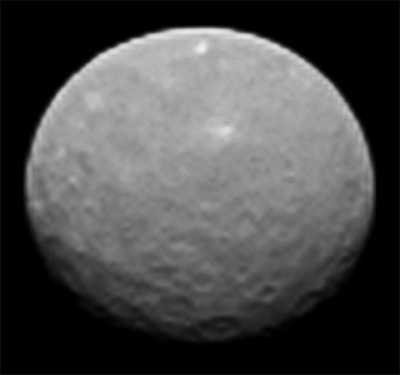
(Using actual distance (146000.0) and size data (975/909 km diameter) for Ceres, 5.8° rotation steps between images, Ceres axis tilt around x-axis -15°, around z-axis -10°, apparent equator diameter 108 pixels.)
First, if you look at the full sequence (square encoded), you may notice, that the right-most 5 frames rotate:

Therefore I'm only using frames 6 to 20 to get a weighted average:

Since the human eye can also merge a rapid sequence of images, here a fast animated gif of the subsequence:

You may note, that the brightness of nearby pixels can vary differently over the frames. This can indicate different slopes, more formally different surface normal vectors.
Different brightness can also indicate different albedo.
Together we get one of the simplest reflectance models, the Lambertian or diffuse reflectance model.
In the case of just one color (grey) and one light source (the Sun), the diffuse reflection is described by just three variable real-valued parameters: albedo (color), and two angles to describe the surface normal relative to the Sun; the Sun intensity can be considered as constant.
Actually the two angles can be reduced to one angle relative to the Sun, since the model is symmetric to the pointing towards the Sun. The intensity (brightness) of the pixel is proportional to the cosine of the angle.

If we now follow one pixel over several frames, the angle of the surface normal relative to the Sun changes, resulting in varying grey values as a function of the frame number.
The model refers to linearized intensities. So instead of the above square-encoded frame sequence, the linearized version is needed:

Raw images are usually square-root encoded; therefore I've squared the pia19179-16.gif images to get the linearized version. If they are gamma-corrected with gamma = 2.2 for standard displays, the result is rather similar.
Merge of linearized frames 6 to 20 by weighted averaging:

The first of the following two diagrams shows the grey scale of one pixel of the longitude/latitude map as a function of the frame number.
The second diagram shows the grey scale function of the 720 pixels of one longitude over all latitudes (in 0.25 degrees steps), meaning one column of pixels:

(For the diagrams here, the origin of the lon/lat maps is the lower left corner.)
Text version for this considered column:
Click to view attachment

Many of the curves in the diagram are rather noisy, others appear reasonably smooth. The jiggery ones are probably mostly due to Moirée-like artifacts near the border of the projected area.
The next days I'll try to match the reflectance curves of each pixel position via RMS minimization to the simulated reflectance curve of a slope on the surface to retrieve albedo/slope data for each pixel.
If the anticipated result won't be too noisy, it may be usable as an albedo map, and as a basis to infere a topographic map.
If the data turn out to be of good quality, residuals may provide shinyness information, according to the more general Phong reflectance model, usable as an indicator for surface roughness.
Ian R
This is fantastic, Gerald, I'm really learning a lot here. I presume you will be applying these techniques to Pluto, once New Horizons begins to resolve surface features?
Gerald
You're quite right. I'm working on improving my capabilities also for New Horizons/Pluto and Junocam next year.
Some others may add their capababilities, too, and we'll be well-prepared for those missions.
Ron Hobbs
DAWN is now less that 100,000 km from Ceres.
Toma B
There is this gif animation on Max Planck Institute site. It seems to me that there are some more details in it than what's been shown in first release. There are definitely more details in craters at the bottom of the image. Central peaks can be seen in at least 3 craters, and there is clearly visible unsymmetrical black layer around that great white spot (best viewed in frame 19).

Click to view attachment # Frame 19 #

So I extracted frames from it and made one of my back and forth animations.
Some more details visible on Ceres surface

Here are separated frames of this animation if anybody else would like to try some sharpen/brightness/contrast/unsharp mask or whatever.
Individual frames of this animation

Sorry for my English...
TheAnt
Thank you Toma for your work on those images.

That bright feature keep looking smaller and brighter and appear saturated in brightness, so I call all bets off for the size and brightness of that one until Dawn get close enough for get get better resolution images.
elakdawalla
That animation is nicer quality than the previously released ones -- it has a wide range of gray levels. Like the still image that DLR released previously, it's been enlarged by a factor of 10 from the original data and then sharpened.

I tried a slightly different stretch on it; I also reduced its size by half, so it's still 5 times the original resolution (click to enlarge):


I'm intrigued by the shape of the limb at the top -- it's clearly asymmetrical during parts of the rotation. There is some topography up there.
Sherbert
Thanks to everyone for their wonderful images. Even with this range of trickery it is still difficult to be certain about specific areas. One thing is certain is that it is a rough and rugged terrain with valleys, craters, mountains and hills all merging.

Looking at Toma's lovely GIF, as the "White Spot" disappears over the horizon there is a hint that it is projecting above the surface. My guess would be a mountain of ice rich material thrown up by an impact. The impact might have been at a low angle to the surface coming in from the Northeast, hence the central mountain is moved Southwestward. The unusually dark terrain would appear to be the shadow of this mountain, but could be different, deeper subsurface material, below the ice mantle, exposed by the "scraping" impact.

I have now decided that it looks most like a Walnut. laugh.gif
Habukaz
Not much of an update, but the Dawn Twitter account suggests that the 12 February images will be released next week, as one could expect. Here's hoping for a Monday release at the latest.

With Ceres having a rotation period of about 9 hours, the fact that a full rotation is photographed should not in itself delay the images much (except from potentially longer data downloading times due to a greater amount of data obtained).

QUOTE (Toma B @ Feb 10 2015, 12:16 PM) *
There is this gif animation on Max Planck Institute site. It seems to me that there are some more details in it than what's been shown in first release. There are definitely more details in craters at the bottom of the image. Central peaks can be seen in at least 3 craters, and there is clearly visible unsymmetrical black layer around that great white spot (best viewed in frame 19).


It really looks like there's a chasm at the lower right limb around the end of that animation.

If there is at least one upcoming image with a similar viewing geometry, then we should be able to see it more or less clearly that it actually is a chasm, if it exists.

There are hints at other (potential) smaller valley-like structures in the same area as well.
antipode
The 'owl eyes' basins just south of the equator seem to both be double ring basins to my eyes. Yet while large they don't seem to be THAT large (~200km on the outside ring?). I know the size of basins where the double ring appears depends on the size and composition of the parent body, and also presumably on the composition and velocity of the impactor. Does anyone know what the numbers for Ceres are?

P
ngunn
QUOTE (Sherbert @ Feb 10 2015, 07:16 PM) *
as the "White Spot" disappears over the horizon there is a hint that it is projecting above the surface.


I'm really not seeing that. To me it looks like it is located inside a big crater which also contains the adjacent dark area. When it's near the limb the long axis of the bright spot seems to be smaller as if part of the feature is obscured by topography, consistent with it being in a hollow.
Julius
I do understand the excitement of trying to Iinterpret features visible on Ceres but would rather wait and see knowing that we will be getting much improved images in the near future so various attempts at interpretation at this point in time seem to me to be premature.
Gladstoner
QUOTE (Julius @ Feb 10 2015, 04:57 PM) *
.... we will be getting much improved images in the near future so various attempts at interpretation at this point in time seem to me to be premature.


Of course it is, but sitting on one's hands until then is no fun. smile.gif
Gerald
QUOTE (antipode @ Feb 10 2015, 10:41 PM) *
The 'owl eyes' basins just south of the equator seem to both be double ring basins to my eyes...

My still a little vague perception has been, that this doubling continues to the west along the presumed valley, and is hinted at at some other locations, too.
One guess for the cause could be exposure of the presumed layering of Ceres' crust.
TheAnt
QUOTE (antipode @ Feb 10 2015, 10:41 PM) *
The 'owl eyes' basins just south of the equator seem to both be double ring basins to my eyes.


They certainly do look very much like double rings basins, the question is if they have been created by the same violent mechanism as found elsewhere. Lets say as on the Moon or Mercury, and the most likely scenario. Yet on Ceres one could imagine that they were not made instantaneous but that the first impact expose ice which sublimate and erode outward for some distance creating the double feature. Perhaps less likely, yet with the distance from the sun/temperature range the latter could be considered.
algorimancer
I've been thinking of these basins as resembling butterfly wings or Rorschach blots... my sense from reviewing the stereo pairs is that the west basin is composed of a larger crater overlaid by a smaller crater on one side. I find the albedo variations interesting. In the stereo pairs, the apparent whitish spot at the center of the left basin seems to correspond to light reflecting off a topographic slope, rather than a genuine exposure of bright material (it could be both, I suppose). I'm leaning towards seeing the lower-albedo (darker) regions within the basins as being actual lower albedo areas rather than lighting effects from the topography; whether the lower albedo is a result of rougher topography or different chemistry remains to be seen. Color images would be really helpful here smile.gif
Sherbert
QUOTE (ngunn @ Feb 10 2015, 09:51 PM) *
I'm really not seeing that. To me it looks like it is located inside a big crater which also contains the adjacent dark area. When it's near the limb the long axis of the bright spot seems to be smaller as if part of the feature is obscured by topography, consistent with it being in a hollow.


This is what I was inferring. The brighter material is the central mountain that forms in an impact crater. If the angle of impact is not perpendicular to the surface, say at 45 degrees, that central peak is shifted and distorted along the direction of flight of the impactor. The impact appears to have ploughed a broad furrow, the dark terrain, pushing the bright material up into a mountain ahead of it. The bright material on the original, admittedly low quality image, seems to be continuing over the southwest rim of the crater. I agree, the mountain's base does appear to be hidden as it disappears over the horizon, hence my speculation it is the "central" mountain in an impact crater.

At this point I would have to echo Gladstoner's sentiments, the speculation is likely to be wrong, but at this time, it's like the fun of trying to guess what is in a present before you open it.
0101Morpheus
If we weren't allowed to speculate than this forum would be quite a bit smaller!

Today makes the beginning of an exciting week for the Dawn mission. Like was explained a couple pages back, from today to the 19th, Ceres is going to triple in resolution.
This is a "lo-fi" version of our main content. To view the full version with more information, formatting and images, please click here.
Invision Power Board © 2001-2024 Invision Power Services, Inc.