Differential Shift method 10E5S with similar color scheme to James (green = no or little ripples, blue = bigger dunes, red = big scary dunes)
Edge artifacts left in (no overlay of terrain):
Click to view attachment
-Mike
Full Version: Endeavour Drive - Drivability analysis
QUOTE (ilbasso @ Oct 1 2008, 01:27 AM) 
Edited: Seriously, James should be invited to be a Rover Driver for a Day.
I'm not sure that's a good idea - you do want Oppy to get to Endeavour don't you?

Seriously, thanks for all the nice comments.
Great work Fran, Mike, Geert, very impressive.
I'm glad we all come up with similar results - that's comforting.

Handy side effect of us all using the same bits of the jp2 I cut up - nice and easy to compare them.
James
QUOTE (ilbasso @ Oct 1 2008, 01:27 AM)
Does anyone else see an interesting 3D effect on James' maps? On my screen (maybe because of my colorblindness?), the red areas seem to be floating above the blue. Cool effect! Awesome work!
OT but, I sometimes see that with strong red/blue colours together as well (without colour blindness).
I believe that it's due to chromatic aberration of the lens in the eye. As the focus point of the red and blue is different, your brain interprets them as being at different distances.
James
QUOTE (jamescanvin @ Oct 1 2008, 08:57 AM)
I believe that it's due to chromatic aberration of the lens in the eye. As the focus point of the red and blue is different, your brain interprets them as being at different distances.
Just to continue this OT point - I'm not colour blind, and I'd agree that the blue feels further back, but oddly the green and the red both feel like they're the same "altitude". If this is purely a focussing/chromatic issue, shouldn't there be a range of depths dependent on the colour?
Andy
QUOTE (AndyG @ Oct 1 2008, 10:25 AM)
If this is purely a focussing/chromatic issue, shouldn't there be a range of depths dependent on the colour?
Of course I could be entirely wrong, that just seemed like the most likely explanation to me, I'm not sure I've ever read anything about it. I'm sure there must be some real research into the phenomena out there, it's probably much more complicated! Any opticians out there?
Here's my crude composite attempt. (No overlay of terrain, black borders, artifacts in place - there is actually a slight gap between the four images if that helps anyone).
Click to view attachment
I'll pretty it up this evening.
-Mike
Click to view attachment
I'll pretty it up this evening.
-Mike
Hi Mike and all the other collaborators,
my cruder attempts are not far behind ... I should have them posted by the weekend
(The people at my work just don't get it -- they continue to make me work on other things!)
my cruder attempts are not far behind ... I should have them posted by the weekend
(The people at my work just don't get it -- they continue to make me work on other things!)
Here is my version of the southern part overlaid onto the HiRISE at 1/4 (and smaller if it's too big )

)
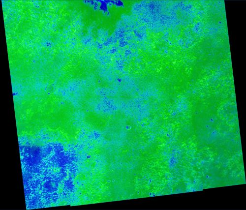
Differential Shift 10E5S version all prettied up.
(Edge artifacts removed, colorized map now overlays HiRise imagery).
Click to view attachment
A 12.5% (1:8) full res TIFF (WARNING: 30 Mb) can be downloaded at: http://www.speedyshare.com/787485233.html
-Mike
(Edge artifacts removed, colorized map now overlays HiRise imagery).
Click to view attachment
A 12.5% (1:8) full res TIFF (WARNING: 30 Mb) can be downloaded at: http://www.speedyshare.com/787485233.html
-Mike
It is wonderful to have these independent efforts by you guys, because it offers the opportunity to check whether the efforts correlate more or less, so giving us the necessary conformation that a method is valid and worthwhile. - So, to all of you who might think that your effort is not quite in the league of James', keep at it, it really is useful to have independent confirmation of results!
Fantastic to see those hitherto hidden rays emanating out from Victoria. It all looked like a uniform ripple field before, but now some avenues might be opening up.
Fantastic to see those hitherto hidden rays emanating out from Victoria. It all looked like a uniform ripple field before, but now some avenues might be opening up.
Still trying to make 'purgatory-type' ripples jump out from the picture, I tried a slightly different trick by processing standard deviation in brightness in only one direction, so instead of processing a full circle around each pixel, processing only along one line in one direction.
Below two images (slightly overlapping) process the area directly south of Victoria using this method, with set direction to South. This trick will more or less 'dampen out' all East-West ripples (as long as there is a clear 'path' going south between the ripples) and 'enhance' all disturbances on a southerly track. Note there are several 'red spots' in both pictures, which seem to compare reasonably well with 'purgatory-type' twisted ripples or at least with ripples with deviate considerable from the east-west direction.
Click to view attachment
Click to view attachment
The red line at the bottom of the second picture is a calculation-artifact, marking the end of the HiRISE image. As mentioned both images slightly overlap. Colors are 'as prescribed', however using this method it should be noted that 'little or no ripples' now only applies to ripples perpendicular to the southerly driving direction, in other words you might have big East-West running ripples but as long as there are wide open spaces between them in a southerly direction the color will turn to green.
Below the same two pictures, however now processed for a south-easterly course. As can be expected there are several differences, and once again there are several 'red spots' in between the ripples. (I tried to stay as close as possible to the original color-scheme with only 'really nasty' spots turning red, however there is no guarantee that this trick really picks out all bad spots and some effects might be from bedrock, etc).
Click to view attachment
Click to view attachment
Once again both images slightly overlap, red line on the bottom is end of HiRISE image.
Click to view attachment
Click to view attachment
Once again both images slightly overlap, red line on the bottom is end of HiRISE image.
Finally, the two original IAS-viewer exports I used, reduced to the same scale as above pictures, for localizing purposes.
Click to view attachment
Click to view attachment
Second of the 'original' IAS viewer crops (sorry for the many posts, but limits on attachment-size interfere)
Click to view attachment
I'm still trying to find or think of some 'fingerprint-algorithm' to catch ripples of a very specific size/shape (f.i. 'purgatory-type') however that's quite a job and my time is limited It looks to me as if finding a fingerprint or face in a database is easier then finding a purgatory-signature in a HiRISE image, at least with a fingerprint or a face you can depend on the user setting a specific scale and direction ('right side up') before starting the computer-processing, but these ripples can be turned and twisted in any direction and at any scale, so it's no use trying to use an algorithm which will only find a ripple which is exactly matching the direction and size of the original example, it has to be able also to find ripples which are 10,20, or more degrees turned from the original and/or slightly bigger or smaller, and then also the sun-angle and shadows are playing tricks on you... all in all it does as yet not sound very hopefull
latest version of my software processing tool can be found here (requires Windows XP/Vista and Internet Explorer)
Click to view attachment
I'm still trying to find or think of some 'fingerprint-algorithm' to catch ripples of a very specific size/shape (f.i. 'purgatory-type') however that's quite a job and my time is limited
It looks to me as if finding a fingerprint or face in a database is easier then finding a purgatory-signature in a HiRISE image, at least with a fingerprint or a face you can depend on the user setting a specific scale and direction ('right side up') before starting the computer-processing, but these ripples can be turned and twisted in any direction and at any scale, so it's no use trying to use an algorithm which will only find a ripple which is exactly matching the direction and size of the original example, it has to be able also to find ripples which are 10,20, or more degrees turned from the original and/or slightly bigger or smaller, and then also the sun-angle and shadows are playing tricks on you... all in all it does as yet not sound very hopefull latest version of my software processing tool can be found here (requires Windows XP/Vista and Internet Explorer)
QUOTE (Bobby @ Sep 24 2008, 09:57 AM)
I have a few Questions:
...
4. Where has Pando Vanished to??? last post in June? Hope he's ok?
...
4. Where has Pando Vanished to??? last post in June? Hope he's ok?
Hey Bobby, can I answer your question #4?!!
I'm ok, just lurking here every once in a while. I must find some time for this stuff, again, soon, or I'll miss the greatest mapping project in the history of the multiverse... umm... or just to keep ustrax in line if nothing else.
(just looked up my old alter ego... holy **** has it been that long?!?)I'm checking the drivability analysis that's going on here and this stuff is just amazing.
Ustrax -- you must already be dreaming what's next after Endurance/Ithaca, as we already know we're going there!

QUOTE (Oersted @ Oct 2 2008, 03:02 AM)
Fantastic to see those hitherto hidden rays emanating out from Victoria. It all looked like a uniform ripple field before, but now some avenues might be opening up.
This thread has had many comments about the hidden "rays" that have been made apparent by the various image processing techniques being used here. I'd like to point out that, while much of the processing being done is amazing, those "ray" features are rather obvious on the original HiRise gray scale imagery. We can easily see those textural areas of small ripples extending into the region of larger ripples to the south. I am attaching a highlighted, cropped, HiRise image at 1/8th scale as evidence.
Click to view attachment
For me, the fact that many of the processed images outline those areas as safe for driving is one indication that the processing analysis is working properly. I think the value of spatially/texturally analyzing the imagery will make itself apparent in areas much less obvious than these "rays."
Finally, I really doubt these features are rays of Victoria Crater. They are areas of smaller ripples within a region of mostly large ripples, all of which were formed very recently compared to the extremely old age of Victoria Crater. Perhaps some underlying feature of Victoria's ancient bedrock debris apron could affect the ripple sizes nearby, but I'm not sure how that might work.
I agree, Tom.
We should not imagine that the best course traverses only sand. Scientifically, the best course will be on the exposed bedrock, diverting only to avoid "sand traps" or to visit interesting cobbles on the sand.
We should not imagine that the best course traverses only sand. Scientifically, the best course will be on the exposed bedrock, diverting only to avoid "sand traps" or to visit interesting cobbles on the sand.
QUOTE (Pando @ Oct 3 2008, 06:00 AM)
Ustrax -- you must already be dreaming what's next after Endurance/Ithaca, as we already know we're going there!
Pando...I've missed you!

And yes...it has been that long but what a fantastic years these have been so far!
About what's next...huumm...I'd prefer not to answer that...but now that Oppy is sent on a new journey maybe it is time to look at Gusev's HiRise images...
QUOTE (ustrax @ Oct 3 2008, 03:05 AM)
now that Oppy is sent on a new journey maybe it is time to look at Gusev's HiRise images...
You thinkin' Oppy can make it all the way to Gusev?
QUOTE (PDP8E @ Sep 29 2008, 09:32 PM)
hi all,
here is a 'Purgatory' animated gif that demos a version 0.2 of the DEM model I have been working on.
Green is drivable
Dark is not
Purgatory is slightly left and south of center (bright in the HiRise / dark in the DEM model)
Cheers
here is a 'Purgatory' animated gif that demos a version 0.2 of the DEM model I have been working on.
Green is drivable
Dark is not
Purgatory is slightly left and south of center (bright in the HiRise / dark in the DEM model)
Cheers
I decided to try a simple analysis to this image to see if I could identify the purgatory type spots where ripples come to a dead end. My technique found some -- but by no means all -- of the dead ends.
Click to view attachment
I did it in photoshop by applying two 15 pixel motion blurs along the general North/South trend of the ripples, subtracting that from the original image, taking the inverse of that difference, taking the lighter of the two versions of the difference, clipping out the fainter indications (that may be the reason it misses some), blurring the result to make it larger and then adjusting the range from gray to white, and applying the result to the a (magenta-cyan) channel of a lab color image.
As I was writing this, I thought of inserting some of the fainter indications ( a less strongly clipped version) into the b (yellow-blue) channel and found it catches more of the misalignments, many of which are not significant, but some may be.
Click to view attachment
It's simpler than the FFT approach I had mentioned before, identifies some of the problem areas, and places them in the context of the original image. I imagine it could be applied to a larger area.
Steve M
Ahhhh, a linear blur! Brilliant!
It might be interesting to shift one of the images to the N or S by a few pixels. The N-S waves will not be affected, but the off-angle pixels will give more of a difference and should result in a more enhanced color.
-Mike
It might be interesting to shift one of the images to the N or S by a few pixels. The N-S waves will not be affected, but the off-angle pixels will give more of a difference and should result in a more enhanced color.
-Mike
Brilliant Steve.
Though I would add that this only has relevance in the large dune "red" zones from James' and others' images. What I mean by that is, in the smaller dune areas such as we encountered around Vostock there is likely "purgatory" shaped dune geometry, but it becomes irrelevant since the wheel size compared to dune size allows the rover to coast right over those. In fact it might be interesting to go back and look at the early route and see how many times Opportunity did in fact cross perpendicular "purgatory" shaped dunes that were small in size. There must have been a few.
Though I would add that this only has relevance in the large dune "red" zones from James' and others' images. What I mean by that is, in the smaller dune areas such as we encountered around Vostock there is likely "purgatory" shaped dune geometry, but it becomes irrelevant since the wheel size compared to dune size allows the rover to coast right over those. In fact it might be interesting to go back and look at the early route and see how many times Opportunity did in fact cross perpendicular "purgatory" shaped dunes that were small in size. There must have been a few.
QUOTE (Juramike @ Oct 3 2008, 06:26 PM)
It might be interesting to shift one of the images to the N or S by a few pixels.
I've seen that work in a test I did, 2px shift after detecting edges then clearing the noise, but couldn't replicate it later.

QUOTE (Fran Ontanaya @ Oct 3 2008, 09:31 AM)
I've seen that work in a test I did, 2px shift after detecting edges then clearing the noise, but couldn't replicate it later.
Gabor filters do that by employing a battery of convolution kernels. It is pretty CPU intensive and well beyond the scope of what I was asking. If you want to try it, that is fine, but I have seen enough results here that will help a lot once we get the new HiRISE down. The reson for my silence is because we are still in the process of evaluating the terrain to determine the initial course towards Endeavour.
If you are getting bored and your fingers are itching to do something here's an exercise for you: in the area south of Victoria find a location where you believe there is the longest stretch of flat terrain, without any obstacles in a reasonably wide corridor (50m?), where we could sequence the longest possible drive.
Paolo
I think Paolo just asked you guys to suggest a.... - route
Exciting!
Does anyone know of an obvious feature in the HiRise images S of Victoria that could be used for a scale?
(A 50 m size crater would be handy!)
-Mike
Does anyone know of an obvious feature in the HiRise images S of Victoria that could be used for a scale?
(A 50 m size crater would be handy!)
-Mike
I understand the question as a single drive where we know how wide the corridor has to be but not the lenght. Regarding actual power and puting every ressource on the drive, what do you think we can plan for? 300 metres?
QUOTE (SteveM @ Oct 3 2008, 12:14 PM)
I decided to try a simple analysis to this image to see if I could identify the purgatory type spots where ripples come to a dead end. My technique found some -- but by no means all -- of the dead ends.
Quite nice, Steve. :-)
Here is the first attempt of mine that looks like anything, for comparison, of a similar area. All I've really done is subtract out what I think of as 'benign' ripples, essentially the straight and narrow ones, leaving what the algorithm sees as large and/or curved ripples to get coded red.
Endless possibilities for refinement but don't know if I'll pursue it. Mostly I wanted to be able to see a large-area dune-field with more red in the dangerous areas and less going on where there appear to be numerous paths through. It almost looks like something now when perusing the entire Vostok-Erebus swath -- but that's a little too much to post!
Click to view attachment
hi,
while I am waiting for my little computer to ker-chunk its way through 300MB of Victoria southward, I thought I share this image with you.
It is a winner in so manner categories, but especially these:
http://farm4.static.flickr.com/3004/290967...44bacb547_o.jpg
My terrain analysis should be done sometime tonight <post it then>
Cheers
while I am waiting for my little computer to ker-chunk its way through 300MB of Victoria southward, I thought I share this image with you.
It is a winner in so manner categories, but especially these:
- best re-use of a Drive MAP
- best use of duct-tape, ever
http://farm4.static.flickr.com/3004/290967...44bacb547_o.jpg
My terrain analysis should be done sometime tonight <post it then>
Cheers
QUOTE (PDP8E @ Oct 3 2008, 09:14 AM)
- best re-use of a Drive MAP
- best use of duct-tape, ever
Well, it ain't got a back set or a rear window
But it still gets me where I wanna go
QUOTE (climber @ Oct 3 2008, 11:01 AM)
I understand the question as a single drive where we know how wide the corridor has to be but not the lenght. Regarding actual power and puting every ressource on the drive, what do you think we can plan for? 300 metres?
Sorry for not being clear. Either single drive or consecutive sols drive.
NO, I was not asking for a path to Endeavour.
Paolo
QUOTE (PDP8E @ Oct 3 2008, 11:14 AM)
...
- best re-use of a Drive MAP
- best use of duct-tape, ever
Alas, I think that one of the major differences between manned and unmanned space exploration is duct tape. Can you imagine how useful a DDD (DuctTape Deployment Device) would have been?
Paolo
For figuring the absolute scale of HiRise imagery:
I got rover dimensions of 2.3 m wide, and 1.6 m long.
I also found this image (PIA05229) (Fig. 2 has a scale - thus Endurance crater can be used for a 200 m reference)
Eagle crater is ca. 30 m diameter {Wikipedia to the rescue again! Wikipedia/Eagle (crater)}
Does anyone know the dimensions (in meters) of the lander in unfolded conformation?
-Mike
QUOTE (RoverDriver @ Oct 3 2008, 09:48 PM)
Can you imagine how useful a DDD (DuctTape Deployment Device) would have been?
Paolo
Paolo
You'd have need to add a... Duct Bay

QUOTE (climber @ Oct 3 2008, 03:26 PM)
You'd have need to add a... Duct Bay
<ducks>
Well, better late than never! I tried many different plans of attack, but in the end could find no combination of attributes that did any better than the single attribute of mean spacing of the ripples as derived from my 2dfft filter. The texture classifier I played with for a while will only give improved results if there are several attributes that together segment the image, but in this case I could not find such suitable attributes. They either weren't very diagnostic or were highly correlated with the spacing attribute. Even the 2dfft is probably overkill, since all the ripples are all in virtually the same direction. So I think my result is very similar to James' result, although I colored it somewhat more optimistically. I also did some work on attempting to pick the ripples to identify the highly curved segments, but nothing worked as well as the very elegant and simple method of SteveM's!
A side note - you will see in my images that the sides of the image appear different than the center. It appears that several images were combined to form the image I started from, and while there is no visual difference (at least to my eye), the difference stands out clearly in many of my computed attributes. For example, the standard deviation of the pixel values is quite different. Did others find this problem, and how did you get around it? Did you start with PSP_005423_1780_RED.QLOOK.JP2 as I think I did, or from a different source?
I have several results to show, and I will spread them out over several posts. All the images here are jpgs, which I needed to use for size reasons. They are also chopped down to some degree. Because of time, I did my analysis only on every 5th pixel in each direction, and put the result in the surrounding 25 pixels in the original image. So I could shrink the result by this factor with no loss of information. All but the main result I shrunk again just to save space. I have all the png files at the 5x5 shrunk scale, which are of the order 20MB, but I don't have any place of my own to post them, and I don't have any experience with sites out there that will host it for me. I'll be happy to provide them if anyone can give me some instructions.
Now that I've put you to sleep with my rambling - here is my result!
Bill
In this post I will attach just the raw color classification. Artifacts from jpg compression are evident, but of course aren't on the original png file.
Bill
Bill
And finally I post the actual values of the 2dfft attribute as a greyscale image. I post it along side the original photographic image at the same scale. To my eye, it does appear that I can see things in the processed image that I cannot in the original. I agree with CosmicRocker that the main lobed features are present in both, but the processed image really does look to me to contain rays, more so than the original. I suspect it has to do with slight topographic highs along the rays, where the sand tends not to accumulate, hence smaller dunes. I would expect such a topographic pattern shortly after imact, but it is surprising it has perisisted to present, if that is the cause.
Bill
Bill
I think the best actual reference to be compared with the dunes we'll have to cross/not cross are the dunes inside Victoria that appear "not so red" but were we can see shape & height.
hey probably not formed the same way as the one on the plain but, is that of any help?
hey probably not formed the same way as the one on the plain but, is that of any help?
QUOTE (wbutler @ Oct 4 2008, 03:31 AM)
I have all the png files at the 5x5 shrunk scale, which are of the order 20MB, but I don't have any place of my own to post them, and I don't have any experience with sites out there that will host it for me. I'll be happy to provide them if anyone can give me some instructions.l
Try speedyshare.com. They will let you upload up to a 30 Mb (actually, I got away with 30.2 Mb) file and they will host it for free. After 7 days with no downloads they delete it. It's amazingly simple, you upload a file and they provide a url to copy/paste for download.
The downside is that the site usually has an advertisement pop-up window that you wouldn't want your co-workers, kids, or significant others to see.
("Honest, honey, it's for planetary science....")
(Yes, you too can become the Porn King of Mars).
-Mike
I have uploaded my png files to speedyshare - thanks to Juramike for the suggestion. The links are:
http://www.speedyshare.com/217480217.html - final blended result of diagnostic and terrain
http://www.speedyshare.com/119902873.html - diagnostic only as green/blue/red
http://www.speedyshare.com/473996607.html - diagnostic only as greyscale
Let me know if I screwed something up and you can't access for any reason. Thanks!
Bill
Certainly looks like wonderful stuff to me. Can't wait for the whole Victoria - Endeavour swath with the new HiRISE.
But after that, the task will be to pore over the maximum resolution images looking for interesting cobble patches, superimpose them on this image (I don't know, as gold or silver stars, or something) then draw a track that sticks to the blue-green, avoids the gnarly red zones, connects as many stars as possible, includes patches of exposed bedrock at regular intervals, and ends up at some juicy piece of Endeavour rim exposure. Bob's your uncle!
Hot ziggity! This is really gonna work!
I've uploaded my non-overlaid tiff files to speedyshare (30 Mb each)
http://www.speedyshare.com/356927428.html - 12.5% resolution (red-blue-green) non overlaid composite
http://www.speedyshare.com/787485233.html - 12.5% resolution (red-blue-green) terrain overlaid composite
Here is a link to a .pdf doc describing the exact method and showing a step-by-step example for the area near Beagle Crater - NW Victoria Crater apron (2.5 Mb):
http://www.speedyshare.com/931443814.html
And here is the unoverlaid Differential Shift 10E5S image:
Click to view attachment
-Mike
Cool, the way the image color scheme matches your avatar, JM!
You must have seen this task coming long ago.
What is your avatar BTW?
You must have seen this task coming long ago.
What is your avatar BTW?
QUOTE (Shaka @ Oct 6 2008, 10:47 PM)
What is your avatar BTW?
Research Triangle (Park) of some sort I guess
QUOTE (Shaka @ Oct 6 2008, 04:47 PM)
What is your avatar BTW?
Pretty nerdly. It is a set of five elements: (from clockwise upper right) Air, Fire, Earth, Wind, and (center) Gaia (lifeforce).
-Mike
(Actually, at this point in my career I'm pretty pleased that I've used 45 of the elements of the Periodic table. Scoring Lanthanide points was tough
.)
I think overlaying two HiRES images taken during different seasons could help identify terrain where the ground has a modest slope to the north-south. The areas where the elevation increases to the south should be brighter during the northern summer than during the norther winter.
This is a "lo-fi" version of our main content. To view the full version with more information, formatting and images, please click here.