Some more thoughts on the distributed computing/mechanical turk method of doing things:
Is there a really wide diversity of dune forms here, or do they all (more or less) exist somewhere on on a continuum of possible forms? If it's the latter, it might make processing of the 'identify this terrain' output data more precise, in that we can take the mean 'ripple value' of the results rather than the modal one.
For example: Say a particular square has five votes for 'terrain type 3' and 2 for 'terrain type 4'. We could then claim the square is type 3.29.
I am willing to do the gridding and contouring for the output data from such a project, should it get off the ground.
Full Version: Endeavour Drive - Drivability analysis
I played with the same image than fredk using GIMP and got this:
Click to view attachment
I pixelated copies of the image to a few square sizes between 10 and 25px, stretched them from black to white and stacked them at 50% transparency (bigger dunes seem to make brighter averages, but if a square boundary catches half a dune, you get an artifact), then gaussian blurred it at 25px, adjusted brightness and contrast, applied a color degradation map and overlayed it on the original image.
Now, who wants to do the same with these images?
http://www.unmannedspaceflight.com/index.p...y&pid=76383
http://www.unmannedspaceflight.com/index.p...y&pid=76383
QUOTE (jamescanvin @ Sep 23 2008, 05:29 PM) 
Yes, that is what I was thinking.
I've started doing Fourier transforms on 256 pixel (east-west perpendicular to the ripples) slices and have confirmed to myself that I can at least detect ripples.
<snip>
I'm sure the signature will change significantly as the ripple size changes. It's bedtime for me now, but tomorrow I'll put the code in place to run these FT's over the whole image and then make maps of various characteristics of the Fourier profiles generated.
James
Nice work with the one-dimensional Fourier transform, but it seems to me that the kind of two-dimensional Fourier Transform used in image processing applications would be more useful for measuring the distance between ripples of arbitrary orientation and would also provide information on the orientation of the ripples (we can't count on their local tendency to a general N-S orientation in this part of Meridiani).
I don't have the math to handle that but you might want to look into it as a possibility.
Steve M
QUOTE (Fran Ontanaya @ Sep 24 2008, 07:02 PM)
I played with the same image than fredk using GIMP and got this:
Nice job. I had noticed that areas with bigger dunes tend to be brighter, so a simple blurring might work. But you might need to worry about trends in suface brightness, ie some areas with ripples of size x may be brighter on average than other areas with ripples the same size. To deal with this some Fourier type method or a simple variance as I did may be more robust.
Grain sorting may be a factor. The albedo of the dunes won't be constant if they are topped by dust. Maybe that's why bigger dunes are brighter on average.
Following up on my previous set of plots, here I've turned my final variance plot above into a colourmap for the original greyscale image. Green means go, red means don't go, and purple is bedrock:
Click to view attachment
The red strip along the bottom and right edges is an edge effect of the processing - it can be cropped away. Again, I have no idea how robust this would be - it would need to be tested on a much larger area. And now I really must get back to work...
Click to view attachment
The red strip along the bottom and right edges is an edge effect of the processing - it can be cropped away. Again, I have no idea how robust this would be - it would need to be tested on a much larger area. And now I really must get back to work...
QUOTE (Tesheiner @ Sep 24 2008, 02:30 PM)
Now, who wants to do the same with these images?
http://www.unmannedspaceflight.com/index.p...y&pid=76383
http://www.unmannedspaceflight.com/index.p...y&pid=76383
Here is the result of a variance-based algorithm on the most ripply of those images:
Click to view attachment
I took a shot at Fred's image and this is what I came up with
Could you guys tell me what are you smoking? 
Doug is gone for two days and this place turned into an art gallery
Don't anyone let Dan cut off his ear! 
QUOTE (jekbradbury @ Sep 24 2008, 09:34 PM)
Here is the result of a variance-based algorithm on the most ripply of those images:
That's starting to look very interesting! Can't wait to see the other images treated this way. I would only suggest (now we're in an artistic mood) a more intuitive color scheme- this one has red at both ends of the scale. Maybe green colors for small ripples ("Go!") and red for big ripples ("Stop!"). And of course the scheme should be consistent for all the sub-images.
John.
Did it have red at both ends?? No wonder I thought it wasn't handling bare rock well...
QUOTE (fredk @ Sep 24 2008, 01:00 PM)
Following up on my previous set of plots, here I've turned my final variance plot above into a colourmap for the original greyscale image. Green means go, red means don't go, and purple is bedrock:
Click to view attachment
The red strip along the bottom and right edges is an edge effect of the processing - it can be cropped away. Again, I have no idea how robust this would be - it would need to be tested on a much larger area. And now I really must get back to work...
Click to view attachment
The red strip along the bottom and right edges is an edge effect of the processing - it can be cropped away. Again, I have no idea how robust this would be - it would need to be tested on a much larger area. And now I really must get back to work...
These maps are pretty good. I did not expect to work this well since the variance filter is isotropic while the ripples clearly have a preferred direction. I would have expected some confusion between ripples and outcrop. Pretty amazing.
Paolo
QUOTE (jekbradbury @ Sep 24 2008, 05:34 PM)
Here is the result of a variance-based algorithm on the most ripply of those images:
Art AND Science!
I like it!
Since the ripples have a preferred orientation, would it be possible to do some sort of transform in a direction 90 degrees to the original? Then stack the images? Sort of like a polarizing filter. Objects that don't have the linear variation orientation of the dunes would end up getting lit up - e.g. bedrock?
(Then you could do the dunes in the cold-colors to warm colors scheme, and indicate bedrock as shades of gray.)
-Mike
Great work with the variance method, amazing.
I've just about got my Fourier method working. Here is a strip of the HiRISE image I've been testing on, chosen as it has some serious ripples on the left and very small ones on the right.
Click to view attachment
Looks pretty good so far
James
I've just about got my Fourier method working. Here is a strip of the HiRISE image I've been testing on, chosen as it has some serious ripples on the left and very small ones on the right.
Click to view attachment
Looks pretty good so far
James
Kudos and high-fives to everyone (but me) for their ingenuousness. However, I for one can't wait to see James' final product.
The "red at both ends" issue was an artifact of post-processing. Here is a fixed image:
Click to view attachment
If anyone could point me in the right direction towards being able to use the JP2s with ImageMagick, that would be very helpful.
Click to view attachment
If anyone could point me in the right direction towards being able to use the JP2s with ImageMagick, that would be very helpful.
I came up with a low-tech method that seems to work:
1) Take image (I used fredk's image as a test); duplicate layer:
Click to view attachment
2) Shift one image 3 pixels to left (crests of big dunes are 7 pixels apart)
3) Make difference of the two images (this will put crests in troughs and make overall brighter):
Click to view attachment
4) Gaussian blur 5 pixels:
Click to view attachment
5) Massively increase the contrast (using levels):
Click to view attachment
6) Merge layers then convert to colorized image (dark = good = green; bright = bad = red):
Click to view attachment
7) Overlay colorized image with original Hi-Rise image (the 5 pixel borders on left and right are lost):
Click to view attachment
The beauty of this method is that even bedrock areas that have big dunes in them get indicated as bad.
-Mike
For those who have GIMP, what about using "Selective Gaussian Blur"? That only blurs low-contrast areas... I'm testing that out as I type this.
Erebus-to-etched terrain shifted-differenced-multiply blurred-contrast enhanced-colorized-and overlay/multiplied image:
Click to view attachment
10 pixel shift to left (in this image, which I think is higher res, the biggest dune crests are 20 pixels apart).
Multiple gaussian blur (I forgot how many)
Contrast level setting is pretty subjective I cut to about 80% of histogram as pure white, 20% of histogram as pure black
Coloring is also pretty subjective (I put yellow as the mid-point)
Overlay using 100% opacity and multiplication of layers.
-Mike
It's funny how everyone's using my IAS Viewer screenshot as their test image. That was essentially chosen by clicking randomly with the zoom tool until I was at 100% scale. I prefer using the pre-Victoria terrain, since we know what it looks like.
I went ahead and implemented a variation on Juramike's first idea:
Click to view attachment
I went ahead and implemented a variation on Juramike's first idea:
Click to view attachment
Ha! We posted at the same time!
(I think my version is more pessimistic!)
-Mike
(I think my version is more pessimistic!)
-Mike
In my version, green doesn't necessarily mean go. Only blue (or, really, purple) means go. Green means driveable. The nice thing about it, though, is that someone with more knowledge of the rover's route through the pre-victoria dunes could cross-reference the colors to the ground truth and get a more accurate answer.
Simple brightness map.
Click to view attachment
I did:
Duplicate background - Pixelate 20px - Transparency 33%
Duplicate background - Pixelate 80px - Transparency 66%
Duplicate background - Pixelate 160px - Transparency 100%
Combine
Normalize
Gaussian blur - 80 px
Color map from gradient (Tropical Colors)
Normalize background
Move the background on top and change mode to Combine grain
QUOTE (Tesheiner @ Sep 24 2008, 01:30 PM)
Now, who wants to do the same with these images?
http://www.unmannedspaceflight.com/index.p...y&pid=76383
http://www.unmannedspaceflight.com/index.p...y&pid=76383
Could someone do the same (break up the huge JP2 file into manageable pieces) for the recent HIRES image of the terrain south of Victoria.
All these colorful HiRISE maps are cool, but more work needs to be done on the algorithms. Some of the places marked in red - for stay away - are actually the best places to go. It's hard to see some of that using my XP machine; but when I check it out on my Vista computer, it is very clear. You can see things like 10 times clearer on Vista using the same program on a comparable computer.
From the looks of it, this is going to be a difficult algorithm to write and make accurate. Good luck.
I'm tempted to do it by hand myself, but don't have enough time.
From the looks of it, this is going to be a difficult algorithm to write and make accurate. Good luck.
I'm tempted to do it by hand myself, but don't have enough time.
QUOTE (Shaka @ Sep 24 2008, 05:32 PM)
Don't anyone let Dan cut off his ear!
Thanks for the clue, Shaka. I found myself scratching my head while looking at Dan's work, wondering how that scoundrel achieved such a result. It's all so obvious, now. 
To the rest of you producing those amazing terrain recognition maps, keep it up. I'm seriously impressed by your ingenuity and I'm really excited with the maps I am seeing so quickly. This is one of the most interesting threads we've had around here in quite a while. I've noticed that some of the methods seem to do a better job of flagging the dangerous half-pipe pinch-offs as red territory. Were not Purgatory and Jammerbugt such geometry's? This exercise is not simply about large versus small drifts.

I'd like to echo previous comments that we should adopt a standard color scale for these contour maps. That would make comparisons easier. Its probably a bit early to make judgments regarding the different methods being used, but so far, Fran's first color map is my favorite. The contours really seemed to hug the terrain changes.
Test pics on GIMP - can someone tell me if these are good or not?
What I did was start out with a very light Gaussian blur, then use 'selective Gaussian blur', which only blurs the low- or no-contrast areas. I used this on the picture until the flattest terrain in it was monochrome gray. Then I used 'fuzzy select ' to select the entire flat region and colored it pale green (hue=125, saturation=100, lightness=70 in case anyone cares). I then took the unaffected (contrasting) region, used 'color balance' and pushed all three ranges (shadows, midtones, highlights) all the way (100) to red on the red/cyan axis.
Green = flat, dark red = crater bottoms, middle red = slopes, light pink = hilltops.
Problems I've noticed: crater bottoms, especially shadowy ones, look worse than they are. (I hope Oppy isn't driving through those anyway!) Also, the amount of 'selective Gaussian blur' is subjective. It's hard to select every tiny color dot in the more complex pictures - especially inside craters.
I performed this process on two of the old route pics suggested two pages back - "backshell to Endurance" and "Beagle to Victoria".
Please tell me if this is any good, or whether I should just leave it to the experts! If you like these, I'll do it on some pics for the route to Ithaca/Endeavour.Click to view attachment
QUOTE (MarsIsImportant @ Sep 25 2008, 06:00 AM)
All these colorful HiRISE maps are cool, but more work needs to be done on the algorithms. Some of the places marked in red - for stay away - are actually the best places to go.
I don't see any gross errors made by mine, but if anyone spots any bad points then let me know. I was using a very simple extraction of data from the Fourier power spectrum so I'm sure there is room for improvement. Determining what is a useful measure is not easy however, so pointers to problematic areas would be useful.
Hopefully I'll have a LOT more data for you to look over this evening (GMT) - maybe even an entire HiRISE image!
James
QUOTE (alan @ Sep 25 2008, 04:52 AM)
Could someone do the same (break up the huge JP2 file into manageable pieces) for the recent HIRES image of the terrain south of Victoria.
Manageable JP2's or another format?
I'm going to be splitting the JP2 into smaller JP2's for processing and could put them on line If required. I don't know much about converting them to other formats though - especially if you want to keep the full 16bit depth.
James
Bingo.
Duplicate layer
Gauss 5px (small ripples are washed, dune shadows over exposed bedrock are brightened)
Difference mode
Combine (results a very dark layer)
Raise both brightness and contrast to 120.
Gauss a lot
Apply gradient map red-yellow-green.
Click to view attachment
Duplicate layer
Gauss 5px (small ripples are washed, dune shadows over exposed bedrock are brightened)
Difference mode
Combine (results a very dark layer)
Raise both brightness and contrast to 120.
Gauss a lot
Apply gradient map red-yellow-green.
Click to view attachment
QUOTE (CosmicRocker @ Sep 25 2008, 02:19 AM)
I've noticed that some of the methods seem to do a better job of flagging the dangerous half-pipe pinch-offs as red territory. Were not Purgatory and Jammerbugt such geometry's? This exercise is not simply about large versus small drifts.
I'd like to echo previous comments that we should adopt a standard color scale for these contour maps. That would make comparisons easier.
I'd like to echo previous comments that we should adopt a standard color scale for these contour maps. That would make comparisons easier.
I don't really remember all the sol-by-sol driving history as we went towards Victoria Crater. Is there a better HiRise image that would make a good test?
Something where we could overlay Oppy's path and use the map-to-field information to set colors that indicate doable and not doable based on Oppy's images (and driving experience). (Purgatory definitely needs to be "red")
We also need an example of "doable" bedrock and "bad half-pipe pinch-off" bedrock in the same image that could serve as a test.
-Mike
QUOTE (CosmicRocker @ Sep 25 2008, 07:19 AM)
I've noticed that some of the methods seem to do a better job of flagging the dangerous half-pipe pinch-offs as red territory. Were not Purgatory and Jammerbugt such geometry's? This exercise is not simply about large versus small drifts.
QUOTE (Juramike @ Sep 25 2008, 12:41 PM)
(Purgatory definitely needs to be "red")
I don't think we need, or even want, a method that tries to classify every ripple and looks for dead ends, etc. What I am trying to produce is a map that says 'Over here the ripples are generally small - you could go around any rouge Purgatories without too much difficulty' and 'Over here are a load of monsters - stay away or you could spend weeks getting through the maze'
A Purgatory type ripple doesn't need to be 'red' if it's easy to go around.
After all, this map is to help get a rough idea of the route Oppy should take to get to Endeavour the fastest - not to find every little danger to avoid (That will be Paolo's job as we go along!)
James
P.S. That's great work Fran - my only worry is that the exposed bedrock is always 'green' I'll be interesting to see how this works over the larger variety of terrain seen on larger scales.
I thought it may be interesting to take part of Fran's map and overlay it with part of Opportunity's route map (in this instance) produced by Phil Stooke. This is just rough, but it gives you an idea of the terrain vs driving route.
Click to view attachment
Nice work everyone. I'm sure Paolo and others are amazed by what you are able to achieve in such a short time using a variety of tools.
Click to view attachment
Nice work everyone. I'm sure Paolo and others are amazed by what you are able to achieve in such a short time using a variety of tools.
That's impressive.
Andy
Andy
I'm impressed too!
Regarding "Purgatory in red color or not" I wouldn't be surprised to find such area in yellow/orange and the area around "Jammerbugt" in darker color.
We should not forget that Purgatory was a bad event, worst than Jammerbugt, not because of the ripples' size but mainly (imo) because the rover was in "blind drive mode" during those old times and when she got trapped on the ripple she continued turning and turning the wheels for the equivalent of 50m (afaik) without "slip detection" and digging deeper in the sand. That was not the case in Jammerbugt when "slip detection" was in use so it was easier to get out of it.
I think I've got an improvement, but my ignorance of Photoshop image manipulation is holding me back.
The key will be to blur out the dune waves slightly (what blur tool?, pixel size?), then phase shift by 1/2 wavelength (in pixels), then create the differential (differential? multiply? darken? overlay? then blur???)
Click to view attachment
Anything that doesn't cancel indicates something shifted (I think I need a blur after the differential is created). So signal after differential = bad/caution; signal cancel = good/drivable
Click to view attachment
Big dunes will have the biggest signal, since the crests will now no longer cancel.
Smaller dunes (with small wavelength) will cancel somewhat have less signal in the differential image.
Flat drivable pavement will totally cancel out, and have no signal and be dark in the differential image.
(And here's the best part)
Flat pavement with big dunes will still have a big signal, since the phase-shifted dunes will not cancel out the pavement response.
I'll try to fiddle with this tonight (since I don't know the right tools or parameters to do this), but does anyone have any suggestions?
-Mike
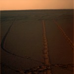
A view toward the flatlands of Meridiani
I am wondering that when have been created the right tracks.
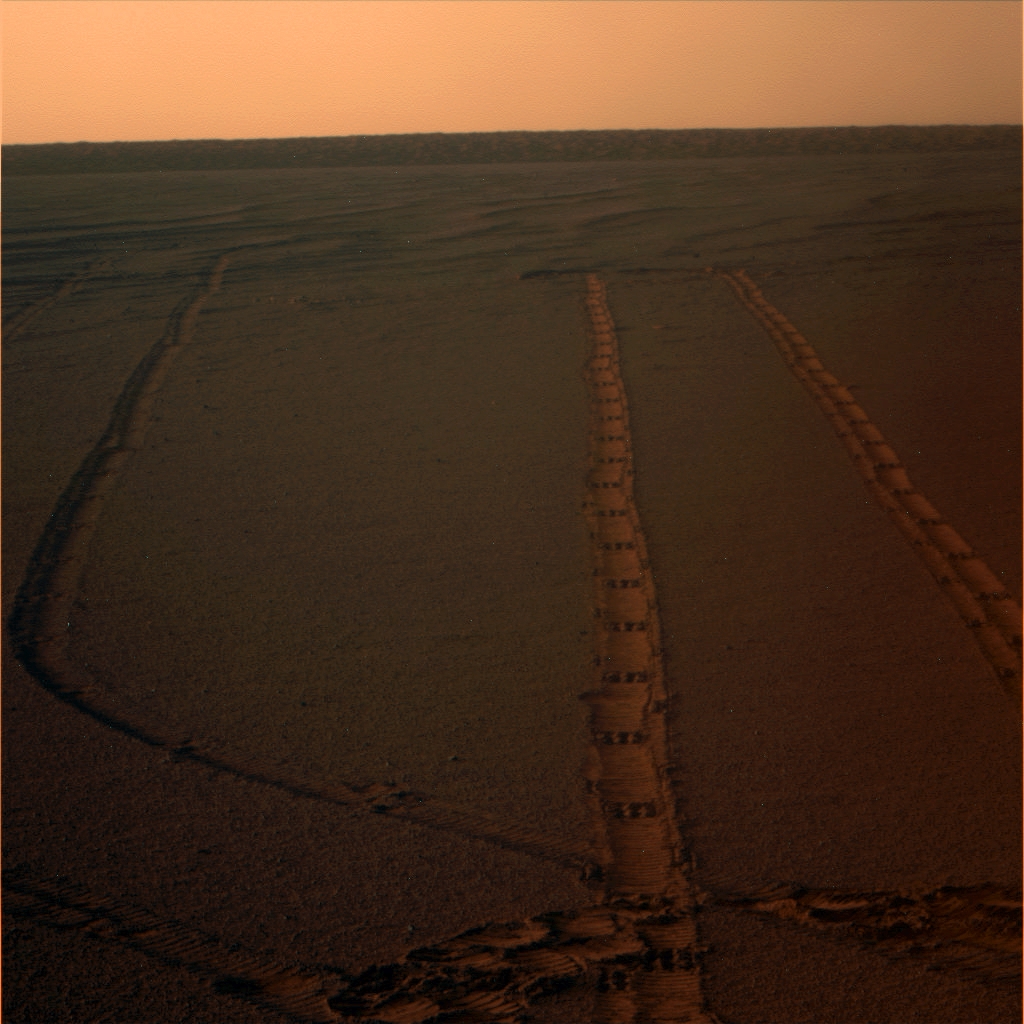
I am wondering that when have been created the right tracks.
QUOTE (Juramike @ Sep 25 2008, 04:10 PM)
I think I've got an improvement, but my ignorance of Photoshop image manipulation is holding me back.
If you keep going down this route you might end up with the Fourier technique that I'm using.
Mine effectively boils down to the strength of repeating pattens across parts of the image. Yours is starting to sound like that too.
QUOTE (jamescanvin @ Sep 25 2008, 07:59 AM)
If you keep going down this route you might end up with the Fourier technique that I'm using.
Mine effectively boils down to the strength of repeating pattens across parts of the image. Yours is starting to sound like that too.
Mine effectively boils down to the strength of repeating pattens across parts of the image. Yours is starting to sound like that too.
Actually his approach is mor similar to correlation which is not rotationally invariant (as applied in this manner). Since the ripples are elongated features and do not change much direction, it seems to be a good approach and the results are quite good.
An important refinement that FT might be able to generate is the detection of purgatory-like drifts. Purgatory not only had a particular height, but the ridge was somewhat diagonal relative to the prevalent ripple direction. I believe I can see some examples of these in the HiRISE south of VC. Visual detection of these drifts might something that the less image processing savy contributors could do.
This image shows what I'm talking about.
Amazing, brilliant work going here, well done everyone who's contributing. I have to be honest: reading all the posts here about the various imaging techniques being tried by people I feel a bit like a dog listening to a lecture on the workings of the LHC, but I applaud you all!
QUOTE (jamescanvin @ Sep 25 2008, 11:59 AM)
If you keep going down this route you might end up with the Fourier technique that I'm using.
Mine effectively boils down to the strength of repeating pattens across parts of the image. Yours is starting to sound like that too.
Mine effectively boils down to the strength of repeating pattens across parts of the image. Yours is starting to sound like that too.
I think the Fourier technique is going to be the best way to do it. The image-based technique depends on regular waveforms that are all parallel and oriented in the same direction, so that an orthogonal shift cancels stuff out.
Any funky non-parallel patterns will throw the image-based technique off.
('Course the image-based technique doesn't require extra programming or math.
)-Mike
QUOTE (RoverDriver @ Sep 25 2008, 12:20 PM)
I believe I can see some examples of these in the HiRISE south of VC. Visual detection of these drifts might something that the less image processing savy contributors could do.
Actually, there might be an easy way to indicate these with the differential shift method as well.
If you shift the second image orthogonally by exactly one big-dune wavelength and take the differential, in theory, all the parallel dune crests should cancel out. Anything that doesn't cancel out (and is therefore bright) is one of these bad dunes.
-Mike
QUOTE (Juramike @ Sep 25 2008, 06:47 PM)
I think the Fourier technique is going to be the best way to do it.
I agree in theory, but Fran's non-Fourier map of the Erebus region looks pretty close to perfect, at least for that test region. We may already have a winner...
John.
QUOTE (alan @ Sep 25 2008, 04:52 AM)
Could someone do the same (break up the huge JP2 file into manageable pieces) for the recent HIRES image of the terrain south of Victoria.
I'm trying to do exactly that, though from from the amazing results posted above I think the "Mk. 1 Eyeball" idea has been left in the dust! How big would be manageable - 250px square? 500?
Incidentally for JP2 manipulation I've been using the (non Free) Kakadu tools to convert to ppm.
OK folks, version 1 of my Fourier technique is done for the whole of PSP_009141_1780. I'm still to make lots of high resolution overlays to see just how well it's doing but from first glance it looks pretty good. Here is the coloured version of the HiRISE 'browse' image.

Click for my website with 2048x5380 and 1024x2690 sized versions.
James
EDIT: BTW, This covers all the route so far and then to beyond "mini Endurance"
Click for my website with 2048x5380 and 1024x2690 sized versions.
James
EDIT: BTW, This covers all the route so far and then to beyond "mini Endurance"
QUOTE (jamescanvin @ Sep 25 2008, 08:21 PM)
OK folks, version 1 of my Fourier technique is done for the whole of PSP_009141_1780.
Now that is truly excellent!
I'm pleased to see that Oppy has already passed through a much denser patch of 'red terrain' travelling down past Erebus to Victoria than anything that lies further south!
QUOTE (SFJCody @ Sep 25 2008, 09:44 PM)
Now that is truly excellent! I'm pleased to see that Oppy has already passed through a much denser patch of 'red terrain' travelling down past Erebus to Victoria than anything that lies further south!
I'm pleased to see that Oppy has already passed through a much denser patch of 'red terrain' travelling down past Erebus to Victoria than anything that lies further south!Exactly my idea
if i had seen a map like this before we went to Victoria.. i would have doubted if it could ever reach that crater..
now things look better..
This is a "lo-fi" version of our main content. To view the full version with more information, formatting and images, please click here.