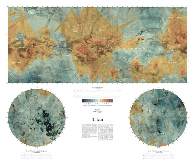
Here's my take on Titan, an effort I've wanted to pursue to get a map that is relatively seamless, relatively tied to scientific reality, and relatively complete. I shared this with a few people last fall.
First, a huge component of what I have began with the maps that Fridger Schempp has posted at the following link. Everything I have produced is built on his contribution, which may well be 90% or 99% of the total work that produced my map.
http://forum.celestialmatters.org/viewtopic.php?t=305My work is based on, in essence, a black-and-white map, which is Fridger's with a few added areas of focus, particularly the northern lakes and seas as seen by RADAR (fused in with IR imagery of southern Kraken), plus some IR coverage here:
http://photojournal.jpl.nasa.gov/catalog/PIA14908The most original portion of my work is in adding a color overlay. Color information for Titan comes from VIMS, and the coverage is highly variable depending upon incidence angles. This produces some ugly seams that I wanted to eliminate at the hazard of throwing out the scientific and accurate information (which is not well captured in those seams, anyway).
My approach in producing the color map was to combine two sources: First, global VIMS maps as seen here in the second map, using channels: B=1.27 μm, G=2.0 μm, R=4.8-5.2 μm.
http://europlanet.dlr.de/node/index.php?id=482I also used VIMS details from the (very exciting) paper here:
http://barnesos.net/publications/papers/20...s.Evaporite.pdfThe second color source (and the bridge used to connect those areas where VIMS coverage is poor) was the thematic mapping of equatorial areas in the particularly inspiring in Figure 19.19 Chapter 19 of "Titan From Cassini Huygens".
My overall approach was to extend the thematic mapping (which had a VIMS-inspired palette for the bright/blue/brown regions) to the higher latitudes, without providing much detail besides the categorical existence of the lakes and seas, and the VIMS-orange areas such as Tui, Hotei, and as seen in the evaporite paper. I blended the thematic map and the VIMS products with no principle other than aesthetics, trying to keep the VIMS details whenever possible without creating ugly (and implausible) seams.
It is exciting for me to contemplate the mapping of chemical composition to color; the five basic colors of my map are:
Blue: VIMS-blue areas, like the methane-wet sands where Huygens touched down. (Dark blue except in eastern Xanadu, where the blue signal covers bright terrain.)
Dark Brown: VIMS-brown areas, the sand dunes in equatorial regions.
Orange: HC3N deposits that are evaporites, left also in cryovolcanic regions.
Dark aqua: The methane/ethane lakes and seas.
"Bright": rendered yellowish in Stephan, et al, but varying in hue in VIMS products, notably more greenish in Xanadu where the 2.0 μm signal is stronger; coincidentally, radar volume scattering is stronger there too, which made me consider greenish overlays to distinguish how volume scattering looks to me in ice. The ambiguity of the composition of this bright terrain fed a major obsession in my reading the past few months; an intriguing story that has left us so far uncertain what is covering the largest portions of Titan.
I've attached a labeled version of the map. This has been repackaged a lot of ways: Unlabeled, a petal map, and a globe. I can upload the unlabeled and petal maps later if people are interested. I also attached some pictures of the resulting globe, and a side-by-side of the Titan globe with the Europa globe I made with the USGS map.
There is some work that can be done, especially in waiting for more coverage of the northern areas, and more VIMS coverage to add resolution in the color, where I airbrushed it into a pleasing but not always accurate seamlessness. But I can say that I have a Titan globe beautifying my home.